Featurin' Pop Art

You'll find various articles on pop culture artists or artworks featured here. This is James Jeans' "Rift"

Featurin' Anime/Manga

You'll find various articles on anime + manga artists or artworks featured here. This is KYMG's "butterfly M82A1"

Featurin' PC/Video Games

You'll find various articles on PC + video game related artists or artworks featured here. This is Jeong Juno's "Last Rebellion"

Showing posts with label review. Show all posts

Anyone familiar with the pop art scene is also most undoubtedly knowledgeable of James Jean. Taiwanese American artist of highly prolific works, you'd be hard pressed to find many individuals who are completely unfamiliar with his art. Lyrical, disturbing, and infinitely beautiful, his art always makes an unforgettable statement. Rebus may not be his premier art book (that belongs to Process Recess 1) but it’s a full blown, full release book not only meant to please his established fans, but to further wow the unexpecting masses. 

Basic Stats
Title: Rebus
Author/Artist: James Jean
Publisher: Chronicle Books
Pages: 240 pages
Dimensions: 23 x 31 cm :: Hardcover
Date of Publication: Sept.21, 2011
ISBN: ISBN-13: 978-0-81187-125-9 | ISBN-10: 0-81187-125-8
Retail Price: 45.00 US


Construction
                As I first held this book in my hands and felt the smooth thick covers brightly adorned with an all over print of James Jean’s art, I already knew this book would be impressive. From the art books I have reviewed thus far, I find Rebus to be closest to the ideal in terms of standard construction. It is hardcover, albeit missing a dust jacket, and the exterior is done with a smooth matte finish, perfect for concealing finger prints or easy to keep clean in general. Smooth and thick boards ensure the interior will be protected for years to come.

               The paper quality is exceptional and some of the best I’ve seen for a mass market, non specialty release. The interior pages are bright white, and super heavyweight (among the thicker sheets I’ve seen) to prevent any bleed through the pages. The semi-gloss finish does a great job of presenting his colourful paintings accurately. I heard James Jean is a real stickler for absolute accuracy of the colours in his reproductions, so I can only assume the images in his art book are also true to the originals. You’ll have to be careful of fingerprint smudges of the full bleed dark/black pages though, so flip through carefully.
                 
Book spines are something rarely mentioned in my reviews, but it stood out for me in Rebus. It's well constructed and tight, but not too tight where you'll hear excessive cracking that not only results in a loose binding, but pages that eventually fall out as the spine completely breaks away from the back. The book can be enjoyed fully open without over stressing the spine. A definite plus to be able to leisurely enjoy the art book without worrying about damaging the book or keeping it in “perfect condition.” 


Standard features have been covered, however I shouldn’t neglect to mention the red metallic gilded pages. It’s certainly a “James Jean” addition that adds some class, yet this nice touch falls a bit short. The foil rubs off easily from normal use. Any of the edges that have had contact with my fingers have already lost their glitz. It’s a shame to see such a beautiful addition lack durability. If there was just one thing I could change about Rebus, I would have LOVED to see some metallic foil used on the covers. James Jean loves his palladium foil on his fine art prints ( Coral Hound especially comes to mind) so if the book cover decoration was done in similar vein, I would have been completely ecstatic…  just a bit of wishing on my part. :)
               
Content
                Rebus is James Jean’s most complete collection of artwork so it’s accurate to claim that it is THE James Jean book. He’s had numerous art book releases in the past, (notably the Process Recess series which is now in the third instalment) but these books have been more “hobby” in nature.  Most of the content in the Process Recess series covers James Jean’s private sketches and works. The first two volumes were also very limited in quantity, distribution, and long out of print. Perhaps one day I’ll find them both for my collection. ^^
                
                     But let’s return back to the actual content of REBUS. Both covers are magnified close ups of one of James Jean’s most recent paintings, “Hounds” from the Rebus show. It’s only fitting he used one of his newest paintings for the art book that shares the same name ^^ Flip a few pages and the reader is initially welcomes by a distinct title page, a circular kaleidoscope of bicycles envelops the title, “Rebus.” As I was flipping through and soaking in the plethora of James Jeans colouring paintings and illustrations, I started to notice something, or more correctly a lack of something. Rebus has almost no notable organization or categorization. To a casual fan or onlooker, the paintings and illustrations appear to have no order (chronological or otherwise). However, after flipping through a 2nd time much more carefully, I noticed I missed a few organizational markers.


               The first fifth of the book are paintings are from “Kindling,” James Jean’s first collection of paintings and gallery show after having left the professional illustration field to pursue his fine art ambitions. Many of these paintings are also his most famous and favourites amongst his fans (Crayon Boy anyone?) The rest of the book is divided between two sections called, “cartoon tainted symbolist narrative computer assisted surrealism 2006-2010” and, “Recess 2002-2004.” The first title appears to be particularly nonsensical, but understood simply, these two sections just display works from their respective time frames.  
                 
          Rebus is almost completely devoid of text. Only three pieces, Procession, Willow Tree, and Rift offer a few written words to the reader as creative stories of narrative behind the pieces. Otherwise, the only words you’ll see are here are names of the art pieces, date of creation and materials used, in super minuscule, microscopic font. Not that I’m complaining though, Rebus is an art book foremost, and what I want are the paintings and illustrations taking centre stage. 


In terms of layout, most of the images are double page spreads or fully laid out on a single page. However, most of the images are not “full” bleed images. What I mean by this is, almost all of them have white borders, either because they don’t fill up the entire page or are purposely laid out to leave a half inch or so of white space to border the illustrations and paintings. Now, this would usually be less than optimal, but I didn’t even truly notice it until I had flipped through Rebus more than once. So, not only had the bits of white not bothered me, they were initially inconspicuous. Perhaps it’s because the book is so large, but this layout decision did not detract from the presentation. A minority of the images are displayed on half pages or smaller, but this again did not affect the overall quality of the layout.

Ending Notes
-  If you really just want ONE James Jean book in your collection, this is IT. It’s the “best” art book to get a sampling of most of his finished pieces. You won’t see many if any of his unfinished/sketch work or lesser known works that are present in the Process Recess series. You won’t regret getting this book
 - The really high score is intentional. Most art books are impressive, but they have one or two glaring faults that I cannot look past. However, Rebus is virtually flawless.

Final Rating
- Strongest point: Everything. James Jeans’ painting/sketches/illustrations are not only faithfully reproduced on high quality paper; the format is also large enough to do these artworks justice. On top of that, construction is impeccable. Quality, quantity, everything is above standard.
- Weakest point: The red foil gilded edges of the pages. Sure, it looks classy, but It rubs off far too easily.

9.9/10 <- Virtually Perfect 

read more

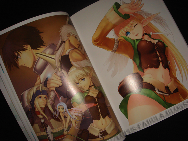
When someone said this book had flocked feathers on the cover prior to its release, I couldn't help but think that the English release was given something a "bit" extra. I imagined some really crazy fluff or fuzz used on the feathers to make them seem real, but alas, I held my hopes too high. For those curious about the "flocked" feathers, there's only a thin layer of fuzz that's barely noticeable. I'd rather have the hardcover, holographic accents  on the cover, and slipcase of the Japanese release. But hey, the NA release is cheaper right? You get what you pay for.            


Basic Stats
Title: Tony's Artworks from Shining World
Author/Artist: Tony Taka (T2 Art Works)
Publisher: Udon Entertainment
Pages: 208 pages
Dimensions: 21 x 28 cm :: Soft cover
Date of Publication: May.24, 2011
ISBN: ISBN-13: 978-1-92677-818-1 | ISBN-10: 1-92677-818-9
Retail Price: 39.99 US


Construction
                I've bought enough art books from Udon to know they follow a strict standard of print for all of their art books. Their mass market books are exactly the same size, have the exact same binding, the same paper is used for the covers and the interiors,  they only print high page count art books (200 pg+) and more or less every book, regardless of their original Japanese form, follows this "Udon template." This isn't wholly a complaint though. They know the quality they offer is good, their books are always reliable, and most importantly, by printing every book in exactly the same way they can cut down on their production costs; by huge margins. I don't doubt that this is a "safe" way to print books, but it does leave much  to be desired. Most of the time the unique characteristics that were present in the Japanese release are "lost in translation" and you're presented with a cookie cutter book that looks exactly like the previous releases, whether it be a horror survival game like RE5, or an anime RPG series such as Shining Wind.


                Unlike the Japanese Edition, the North American Edition is constructed a bit differently. It's soft cover, lacks a slipcase, and it doesn't have holographic accenting on the covers (aside from the title which is done in silver foil). Instead, only the feathers on the front cover are "flocked," as well as some embossing done on the green swirls instead of the holograph foil that was used in the Japanese edition. I suppose the raised glossy print for the green swirl design is pretty neat and shows Udon's attention to detail. But the "flocked feathers" were done in vain because the fuzz is barely noticeable. I'm also paranoid that it will pick up dust/grime more easily.            
                Enough about the cover though. The interior pages are great quality like the usual Udon fare. The pages are thick enough to prevent any light reflecting through and the slight gloss on the pages works well. There's no bleed and the pages are thick enough so the images are displayed beautifully.
                Print quality is also above average and I'm confident enough to say that Mr. Taka's work has been reprinted faithfully. It is a bit difficult to gauge since his colouring is on the more subtle end, but they show in nice, soft pastels, so they definitely didn't mess up there.
             

Content
                When glancing at the Table of Contents, it shows that Tony's Artworks is divided into four sections, each with a flowery and rather nonsensical title. Each piece is also thumbnailed as a preview, with complete information on where each image was used. Pretty neat and thorough! I won't go into exact details but from what I can see for myself, there are only two "real" sections. The majority (roughly 2/3rds) of this book is comprised of full colour illustrations with or without backgrounds and a smaller section (about 1/3) is a character design section. Several pages (less than ten) are dedicated to two interviews of Mr. Taka, a tutorial of the cover and a few b/w artworks.

                As the cumulative artwork for the Shining Tears and Shining Wind series', the work he had to do is certainly extensive and I’m thoroughly impressed by the sheer amount of full colour illustrations he managed to churn out during his time with the video game series. They’re action RPGs, not visual dating games, so this amount of artwork from a single artist is usually quite unheard of.  I imagine it must have been very taxing on Tony Taka, especially considering his origins as a doujin artist. Perhaps, he could have tried to illustrate more dynamic scenes since almost all of them are static, but I do understand that he hasn't had much practice drawing them.
                The last third is devoted to character designs from both games. I don't have much to comment about them, but I did appreciate the attention to detail. They're not just simply printed on blank sheets, but the vine and dot pattern added in the background works well without being too distracting. I also like how even the most minor characters have at least two depictions (a close up and a full body). Some of the major characters have three+ or even a few pages dedicated to them.
                If I could just make the smallest point of criticism about the art work, it's the fact that Mr. Taka is foremost a character artist of young females and he isn't interested in much else. On the other hand, this complaint is not entirely fair, since...  as one  of the few collections of his non-H work, this art book actually offers a lot more variety and less focus on girls in compromising positions. However, I cannot deny that "fan-service" is still very strong. Mr. Taka has made an effort to draw more males, decrease his "pin up" favouritism, and even create some anamorphic designs. For "working outside his comfort zone," I commend him.


Ending Notes
-  Tony Taka poured his sweat, blood, and, tears into the Shining Wind Series and that amount of devotion doesn't go unnoticed. I wonder how much time he had to put in to illustrate all of these paintings. He must work fast.
- This is most likely the single biggest collection of Tony Taka's non-H work so if you're a fan of his work, you won't wanna miss out.
- Something I only noticed while reviewing this book, The back shots of Elwing and Xecty on the back cover show sublime Mucha-esque hair. I adore! XD

Final Rating
- Strongest point: The sheer quantity of full colour, full background images. Tony Taka worked his ass off when making these games and he very well exceeded what could be considered to be a "normal level" of contribution.
- Weakest point: The "Udon Template," meant the loss of the Japanese perks (hardcover, holographic cover, slipcase). I value the quality of materials used in the Japanese release more than being frugal so I will most likely purchase the Japanese release again. For those of you like me, skip the NA release and import it from Japan instead. 


8.9/10 <- Aside from my complaint about the "Udon Template," I can't deny its artwork quantity and adequate construction quality.

read more

In complete honesty, I was a bit hesitant to purchase Krenz's Art books. I love talent in many different forms, but his focus on cute looking females isn't really my thing. If I see an artist that almost solely draws moe girls it really takes something special or exceptional to pique my interest.  Well, I was pleasantly surprised at how his females had more variety than the usual moe girl (or what his covers falsely led me to believe), but well... don't judge these books solely on their covers. There's enough variety to please most fans of anime/manga inspired art. These books are further personal hobby releases so I'll further provide some advertising and information on how to directly purchase them from the artist. I love promoting lesser known artists so please support Kreuz!!!! :D

Due to the similarity of content and presentation of Krenz's books,  I have decided to review all three books in one cumulative review.

* I apologize for leaving out photos of Book I+II. I didn't have it on hand at the time of this review, but books 3 and 4 are very similar to the first book.

Basic Stats
Title: Krenz's Artwork I+II, Krenz's Artwork III, Krenz's Artwork IV
Author/Artist: Krenz (Cushart)
Publisher: Gain-How Printing Co. Ltd.
Pages: 40 pages, 48 pages, 48 pages
Dimensions: B5, A4, B5 :: Softcover
Date of Publication: July 2010 (Reprint), July 2009, July 2010
Retail Price: $7.00 USD each :: Shipping worldwide is an additional $5.00 for each book when purchased directly from Krenz.


Construction
                The quality of build on these books are above average for  doujin releases. I love the smooth matte covers. They're thicker than the usual fare and look like they'll withstand a fair amount of damage for being single ply. They're definitely a heavier and treated cardstock.  All of the pages are glossy, and I found this helped incredibly towards the polish of the presentation. It might just be my monitor, but when browsing Krenz's gallery, I felt the images were just a bit too washed out, or the colours just a bit too soft and subtle. I can happily say that the print reproductions look even more fabulous than what you see online. There's just enough pop and contrast to add a layer of vibrancy, while at the same time they're still soft and close enough to be faithful to his original digital paintings. Perhaps... it's just me, but I felt that his images online pale somewhat to his images in print.


As for the format, I'm sure that my readers are now well aware that I believe that size matters. Although big is almost always better, I found myself preferring the perfect binding done on the B5 books (1+2, and 4) instead of the simpler staple binding of the A4 book (III). I noticed that there were some crease marks in the back of the A4 book due to the staple binding. Now, if future books are perfect bound AND A4, well that's the icing on the cake.  (nudge, nudge Krenz XD)


Content
                Krenz's Art books feature a mix between his professional and personal works. I believe his professional work comprises mostly novel covers with some game related character designs mixed in among the pages. His earlier books have more original artwork while his newer volume (IV) is more focused on character designs.
                I prefer the older volumes because they include more full blown illustrations and less sketch work or character designs (not that his sketch work is any less impressive, I'm just a fan of all over colour). He wisely presents these paintings in either double page spreads or full page bleeds. There is no white showing and I remain firm that this is the best way to have artwork formatted on a page. I have to admit though, I liked the creative way he used to display illustrations in book IV. He would have a three quarters of the page for the finished piece, and three mini images of the work in progress, from rough sketches to basic colour blocking. Refer to the blonde elf to see exactly what I'm talking about. 
                Krenz is effortlessly versatile. He likes doing fantasy, but his true passion appears to be drawing real world characters, or atleast characters that wear contemporary clothes and live in worlds that mirror our own real world. Just as his colouring and shading is soft and subtle, he's not an artist that tries vainly to go all out. He prefers to keep his art understated, with his style the only thing needed to give the artwork a spark of fantasy. I admire how he doesn't try too hard to capture the eye of the viewer. His art remains  serene and ultimately evokes a sense of a comfort.
                If I could find any fault in his art, it would be that he strongly prefers to draw and paint females. I would like to see more males as they only make up 15-30% of the representation in his books. He's very capable of drawing males, I daresay he's better at drawing males than females. His pretty boys look great, his gruffer middle aged men look good as well, hell even his old bearded grandpas kick some major ass!  His men manage to look different, both in terms of demographics and personal characteristics. They have different faces, body builds, etc. Personally, I couldn't help making a comparison with Range Murata in this aspect.


Ending Notes
-  The books are hella cheap (price not quality) and a worthwhile purchase for anyone interested in anime/manga styled art. His work will appeal to both males and females, even if most of his subjects are young women.
- His dragon is eye popping fantastic. I wonder how skilled he is at drawing other animals, both real and imaginative.
- He likes pink. He likes pink alot. XD

Final Rating
- Strongest point: Krenz's portrayal of males displays not only his skill and understanding of the male form, but he's not afraid to show a strong degree of variety. His males all have different characteristics.  
- Weakest point: I couldn't think of a real fault so.... I'll just make one point. I wanted MORE males. Male to female ratio is WAY TOO LOW!!! :D:D:D:D:D:D

7.8 /10 <- Above average and great quality.

*** Please contact Krenz at hydrakrenz[@]hotmail.com or visit his DeviantArt page at http://cushart.deviantart.com/ for full details and to place an order.  


read more

Construction & Content
I know it's been forever with my last review and I wasn't feeling up to a full art book, so instead I chose to do a mini review on a book that isn't exactly an art book.
While I'm sitting here twiddling my thumbs and wondering when exactly Square-Enix will release a very overdue art book for Final Fantasy XIII, this mini book will have to do for now. 

Final Fantasy XIII : Corridor of Memory - Episode i - is a mini preorder bonus that was available in Hong Kong. In terms of its size, shape and overall content, it's comparable to the EBgames/Gamestop freebie art books that have been common preorder freebies in the past.
It's completely written in Japanese, which is unfortunate for me, since the meat of this book is the actual writing and not the pictures.

The first 20 pages of content in this book is what it's titled after. - Episode i - is the epilogue novella of Final Fantasy XIII written by Eishima Jun. I wouldn't really have thought much of it if it was standalone, but given the fact that we now have a confirmed sequel, I suppose this short story on what happened AFTER Final Fantasy XIII holds some weight as canon. I skimmed through the English translation, but you won't be missing much if you miss this little bit that bridges FFXIII and FFXIII-2 .


The middle 36 pages are devoted to a section called Reminiscence. It looks to be a collection of the extra scenes in the game that never made the final cut. The writing is obviously not doing much for me but the small screen caps along the edge I found to be the neatest things in the entire book. They're the corresponding scenes, but only preliminary CG renders since they never made it to the final cut. Very cool even if they're tiny and hard to make out.


The final 20 pages are the "fanciest" pages since they include double page spreads of the promotional CG renders/artwork for the game. You know... these are the images that are made into posters, plastered on to every bit of related merchandise, made into wallpapers by fans.... the images created to impress. Not that I'm complaining though. These eye candy artworks are the best renders made for the game, and damn it shows.


 Final Rating
- Strongest Point: Loved the behind the scenes/deleted material
- Weakest Point: Size is far too tiny to do the content justice. Especially the full CG renders. Would have been nice to have been available in English.

Numerical Rating: N/A

read more