Featurin' Pop Art

You'll find various articles on pop culture artists or artworks featured here. This is James Jeans' "Rift"

Featurin' Anime/Manga

You'll find various articles on anime + manga artists or artworks featured here. This is KYMG's "butterfly M82A1"

Featurin' PC/Video Games

You'll find various articles on PC + video game related artists or artworks featured here. This is Jeong Juno's "Last Rebellion"

                I found this used somewhere a few years ago... and I can't really recall how. Most likely it was one of my trips in Korea when I had the liberty of rummaging around internet cafes to find some rare Korean books. ^^ My memory is also foggy with some of the details of this book. It is published by CGLand, a Korean community for digital artists (they recently published Kosmos, which I also need to get my grubby hands on) and I believe this was limited to 999 copies? I can't say with 100% certainty but that’s the number that pops off the top of my head and I’m sure it was less than 1000. Back to the main point though… if you really want a sentence long review, it's the Korean "counterpart" to the Ballistic Expose series. Why do I say that? I think the photos will be serve as enough evidence. 
 

Basic Stats
Title: The Light - Digital Artworks 1
Author/Artist: Various
Publisher: CGLand
Pages: 182 pages
Dimensions: 22.5 x 31cm :: Hardcover with Dustjacket
Date of Publication: Jul. 05, 2005
ISBN: ISBN-10: 89-954099-1-6
Retail Price: 39000 won


Construction
           When a book goes over 30000 won (30 bucks) in Korea, that means it's expensive and presentation should very well exceed typical books. I think The Light is a pretty good representation of this. The hardback covers are durable, heavyweight and exceptional quality. The binding is good... I might have heard a slight crackling when opening the book fully though,  and the glossy dustjacket does its job of protecting the covers.  I can't find any glaring flaws in terms of construction, perhaps only a few minor things that are really depend on personal preference. The paper is high gloss. I’m not a big fan of high gloss but I didn’t find it too distracting here, and strangely pretty resistant against finger print smudging. Almost all of the pages are black which are notorious fingerprint smudge magnets, but yeah I don’t notice this happening very much at all when flipping through. Paper thickness was also very good. I didn't notice very much reflecting through the pages, but that may have also been because there was very little white/blank unused space.


Content
                The Light is foremost a digital collection. That doesn't mean there's only 3D renders present... I'd estimate only 1/3 of the work included is 3D and the rest of the two thirds are 2D. A few look like they were even done traditionally but that's just the skill of the artist in mimicking traditional mediums. ^^;;
                Seven sections divide this book: Character, Low_Polygon, Illustration, Transport, Military, Fantasy, and Architecture & Interior. Personally, I don't think some of these are even needed since they can be only a few pages long. Fantasy can just be classified as illustration and transport + military can be lumped together. The vast majority of the pieces are character work and illustrations, while a smaller portion includes real life renders of things like cars, battle ships (sorry I forgot to take a photo of one!) and even buildings + interior designs. I've already touched upon it, but this book covers alot of different material. It does lean heavily on the fantasy/character side of things so individuals looking for that won't be disappointed. However, people who want artwork that is more derived from technical realism on real life objects like cars or ships, may be disappointed.
                Just as there are a multitude of subjects covered, there are also a multitude of artists and styles. Much like the Ballistic series each artist will have 1-3 pieces exhibited within. The entire layout is also very reminiscent of how the Ballistic books are done. Most of the images are full page images on black backgrounds. The rest are half page sized and a few double paged spreads are included as well. You get minimal if any blank pages at all since black is used as the background colour. I wouldn't be surprised if they saw Expose beforehand and liked how the Ballistic books were formatted and decided to do something very similar.  

Ending Notes
-  When this book came out, quality CG related art books were rare in Korea. I’m satisfied by the quality of this book and how it paved the road for more books like it to be published.
- Why did it take so long for CGland to publish a successor art book? Kosmos only came out in 2010 so you have a 5-6 year gap which is pretty huge. It’s a shame The Light was pretty much only a single volume and not an annual it was set up to be.

Final Rating
- Strongest point: You get a vast sampling of digital art. 2D/3D.. everything from Character designs, illustrations, mechanical designs, hell even architecture.
- Weakest point: This is really going out on a limb, but it might feel like a "random catalogue" to certain individuals. It covers so much, there really isn't a central focus.

 8.7/10 <- Solid release, hard to find any flaws.

read more

Nakajima Atsuko's style was a staple in many anime series during the 90s and early 2000s. Quite frankly, I'm a bigger fan of how anime was drawn back then compared to the more simplistic styles of today, so it was refreshing to go back to a style I was more familiar with during my younger days. Huge shiny eyes may be Ms. Atsuko's trademark, but I love how they don't fall into the overly girly or childish depiction which is what you'd normally expect from saucer sized high gloss eyes. Her characters manage to look older than the norm of prepubescent teens, which really makes her artwork instantly recognizable even given the multitude of series' she has provided illustrations for. Unfortunately, only a few are covered in this art book.
Basic Stats
 

Title: Tsuya Nakajima Atsuko Style
Author/Artist: Nakajima Atsuko
Publisher: Mag GARDEN
Pages: 112 pages
Dimensions: 21x 29.7cm :: Soft cover with Dust Jacket
Date of Publication: Jul. 1, 2004
ISBN: ISBN-13: 978-4-86127-049-9 | ISBN-10: 4-86127-049-9
Retail Price: 2095 yen


Construction
                There isn't too much to comment on this book in terms of construction. It's very standard for a Japanese release. It's roughly A4 in size which is the standard viewing format for Japanese art books in general. The covers are done with the generic single ply of semi gloss card stock. Not very strong but a glossy dustcover gives adequate protection. 
 
 Nothing fancy. The dust cover does scuff a bit easily overtime so something a bit more resilient would have been nice. I thought it was pretty interesting how the covers are the rough sketches of the completed cover images. Interior paper quality is above average though. Nice and thick semi gloss pages work well and there is no reflecting even though I can see that most pages are saturated with colour. Print quality and colour reproduction is alright, but nothing to rave about since the cel shading can't really be too difficult to produce accurately. 


Content
                It's a strange thing because I wasn't initially familiar with Ms. Atsuko's styles from the shows that are represented from this book. I remember her Rurouni Kenshin promotional covers leaving the greatest impression on me and I only vaguely remember her work from You're Under Arrest and Getbackers. It's most likely due to the fact that I've never watched these shows. ^^;;; But yes, You're Under Arrest and Getbackers are the main two series covered in this art book with Getbackers taking most of the spotlight. Maybe 10-20% of the book is dedicated to some other cutesy anime which I cannot name but these two series dominate with a few pages dedicated to Ranma 1/2.


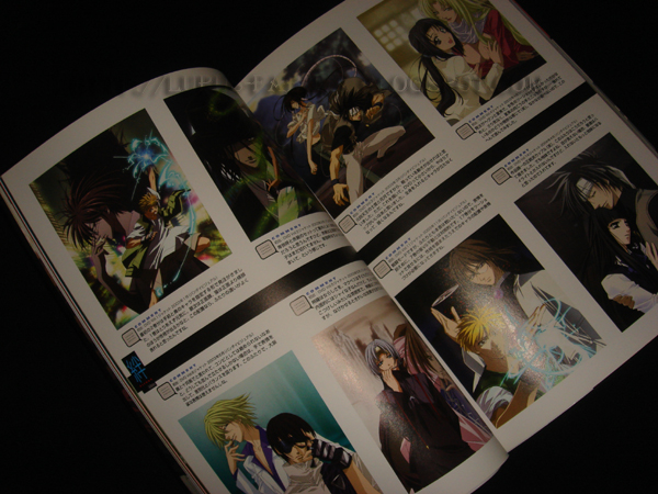
              Most of the images are pinup style illustrations (the majority of them being yaoi-esque images of the two main characters of Getbackers), in full page format. The book is varied to a lesser extent and you'll see some different forms of presenting the illustrations. Half page, double page spreads, quarter page illustrations, everything is pretty much done in this book.
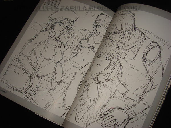
               The second half of the book is all black and white sketch work. You'll see some of the completed images that were displayed earlier in the book in sketch form with a page or so of commentary along with a multitude of character design sheets used in the anime or just some random rough work from Ms. Atsuko.
                The last several pages I missed the first time I flipped through but the book, but it does end with a few more anime series being covered. One is something called Peacemaker which has a few pages dedicated to it and Kenshin gets a whopping two whole pages. ;_;


Ending Notes
-  Reminiscing about a style of the past is a good feeling. I still love Ms. Atsuko's big-eyed style more than most styles of today.
- I would have greatly appreciated seeing something other than cel shading in her completed illustrations. 

Final Rating
- Strongest point: It has variation from "just art" for people who enjoy it. Alot of notes, commentaries, almost a half and half mix between sketches and illustrations.
- Weakest point: "I" didn't like all of the black and white 
sketch work plus notes taking up almost half of the book. 

7.3/10 <- SLIGHTLY ABOVE AVERAGE

read more

                One of my favourite Korean dongin artists out there, her art is instantly distinguishable and even in her earlier days I was always left wondering and anticipating her full colour art book. For a comic artist it's evident that her true skill shines in her colour works, which isn't as common as you'd think with artists in this industry. I have to say with all things considered,  I'm satisfied with the result.

Basic Stats
Title: AQUA: Kine in Aqua Illustrations 2003-2009
Author/Artist: Lee, Sun Young (Kine)
Publisher: Self (Private Publication)
Pages: 160 pages
Dimensions: 21.5 x 29.5cm :: Soft cover with Dust Jacket
Date of Publication: Jan. 2010
Retail Price: 15000 won

*I have to apologize for the quality of some of the photos. I did quite a few retakes and some aren't as clear as they should be.


Construction

                With many doujin/dongin releases you can't achieve the quality of a professional commercial release due to financial constraints or the lack of availability of options. I'm satisfied that this book doesn't suffer from this common issue and looks as good, if not better than many commercial books. The format is a nice ample A4 and the overall build quality of the book itself also appears to be great. The spine is strong, and the glossy dust cover is also a fine detail in terms of the finish. Usually, I can't help complaining about soft cover art books, but the dust jacket does add enough protection for this to be a minor issue in this case. I must say though, that the strongest detail of this art book is the paper quality. I absolutely adore the paper and it is one of the finest examples I have ever seen. It's not very fancy or innovative, but a heavy weight matte card stock just is "discreetly" perfect for the job. There is absolutely no reflecting or bleeding through the pages and it feels so nice to just flip through leisurely without having to worry about bent or damaged pages. I don't mind it at all if some details appear to be a bit dull due to the lack of gloss. It is quite simply put, one of the best possible paper types for art book use.
                Unfortunately, I can't say the same about the slipcase the book came with. It's pretty with its metallic gold inlay, but the cardboard is too thin and it feels flimsy. Also as you can see, the glue is already coming off one of the sides and it's falling apart. A nice attempt to include a slip case that can house the book, but the quality prevents it from being very useful.


 Content
                From what I can tell the artwork is a collection of every previously "published" piece since 2003 until 2009, which is a six year period. Like I said, I haven't been able to find any unreleased or new pieces and everything has been available in some form before (i.e. buttons, bookmarks, calendars, posters, donginji, etc).. not that that is a bad thing. Just don't expect any surprises. The book is roughly two thirds of original work and a third of fan pieces from various fandoms. The art is also ordered chronologically from newest to oldest.  Her original works consist mostly of the ones featured in her calendars and shopping bags but many have also been previously printed as other goods and even promotional materials. The fan artwork is mostly Bleach and Naruto orientated but you'll see a scattering of others as well (Prince of Tennis, Reborn, Black Butler, etc)
                I have no problems with the selection included since it is diverse and collects pretty much everything,  but the best point is the presentation. This art book is printed in my favourite way, full page bleeds or double page spreads. You will see minimal white in this book since almost every image fills the entire page. Aside from the title, a brief afterword, and publishing notes there are absolutely no words in this art book. You get as much art as you possibly can. Interviews and commentaries are nice but nothing beats pure unadulterated art work. 


Ending Notes
-  The quality of the release for a dongin art book. For the most part the quality is fabulous. The paper being the best part.
- The price is cheap by North American standards
- Her gorgeous colour works are represented true to their original form

Final Rating
- Strongest point: The cardstock matte paper. Not only is this perfect for displaying the images, the paper quality adds heft to the book to make it appear very thick.
- Weakest point: The slipcase. It's cheap and easily comes apart. 

9.5/10 <- MOST EXCEPTIONAL

read more

I thought this day would never come. 

              Mr. Jeong Juno.. arguably my favourite artist of all time (he beats out hundreds of others) has published a completely personal and MASSIVE compendium of almost all ( I would guess) of his artwork spanning a very dynamic 10 years. The artworks featured are not only restricted to his professional career, but you’ll see a few of his personal fan creations as well.  In other words, it’s the most complete collection of Jeong Juno’s artwork ever released to date. To put a scope of how much that is… this book is almost as thick as a phone book and his art is displayed in full page format on almost all of the pages. Yes, this is at least 95% of pure unadulterated artwork spanning 400 pages.  I know.. simply mindboggling.

**Please keep in mind that for the interior photos, I tried to take samples that are rare and hardly ever been seen before. These photos are not true to the proportional representation of the artwork featured in Junography (i.e. you'll see alot more Lineage pieces in the actual book than what I preview).

Basic Stats
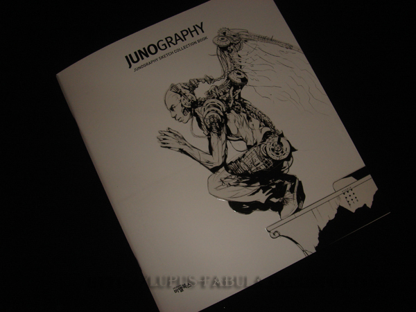
Title: Junography – Juno’s Illustration Work Collection Book 1998-2010
Author/Artist: Jeong, Juno
Publisher: Viel Books
Pages: 390 pages
Dimensions: 21.8 x 25cm :: Softcover (Turtleshell)
Date of Publication: Nov. 25, 2010
ISBN: ISBN-13: 9788996468608 | ISBN-10: 8-99646-860-6 l
Retail Price: 35000 won / $55.00USD Shipped to ASIA $69.00USD Shipped ELSEWHERE when purchased directly from Viel.


Construction
                The construction of Junography is fairly standard fare to the usual high quality printing standards of South Korea. You won't see many hardcover books like you do over here in North America, and this is no exception. Junography is presented in the common dual layered paperback format which is popular in Asia and also referred to as the turtleshell. It's studier than normal paperback and similar to a hardcover book which  I personally like to call paperback 2.0. A textured black piece of paper is an introductory wrap around the book, noting the basic details of the book's contents. The cover has a glossy coated finish with holographic inlay used on the title. I can't  comment on colour reproduction since I have never seen the original, but I would guess it to be fairly accurate. The interior pages are somewhat thick, with thankfully only a semi gloss finish. I find  that although high gloss paper is great in portraying the fine details of digital images, the reflection of light is often too distracting to fully enjoy the piece printed on this kind of paper. This is a perfect balance. However, I'm not completely satisfied by the thickness of the paper,  itself. It's thick enough to work most of the time but there can still be some reflecting through the pages if they're blank and the light source is bright. It's not a huge issue but it's still there.  Unfortunately, the exterior covers appear to be a bit easy to scuff. This is most likely the only real construction flaw of this book.


The preorders of Junography were treated as a special editions and you received some bonuses if you manage to snag a preorder. Included was a cardboard hard case used to enclose the book and a smaller sketchbook. I was impressed by the quality of the case since it's strong and rather heavy weight and houses the two items very nicely. The sketchbook was also a very nice bonus since Mr. Jeong's artwork is seldom published in such a raw form. The illustrative sketches are especially impressive due to their details and complexity. I'm sure amateur artists are eager to try colouring using his line work.


Content

                Again, all the artwork featured here are pieces from his ENTIRE art career. His most prolific work was done for the Lineage II franchise, but in all honesty, you’ll see all the work he’s done for a whole variety of different projects organized in a rough chronological order from his newest to his oldest pieces in the twelve year span.  


Some other examples of his usual concept design and illustration expertise include works from: Ghost Fighter, Immortal Online, Dragooneer's Aria, numerous Korean fantasy novels, N-Age Reverse, N Pluto,etc. Many of the games will not be familiar to people outside of Korea or Asia.


The layout is very simple since it is an art book and therefore the art takes on the main focus. Usually, you’ll see a character design on one page with a monochromatic background. However, he doesn’t skimp on the much more detailed and elaborate illustrative pieces either, as most are done 3/5 spreads across a double page. Fortunately, this set up was well thought out since although a full double spread would be larger, the book’s spine usually ruins the centre (and usually focus) of the illustrations.  Naturally, the elaborate illustrations are my favourite pieces featured in the book and you'll see about a hundred or so of these more illustrative pieces.  Peppered throughout the concept designs you’ll also see notes and short commentaries that add a little bit more of an interactive experience to enjoy while admiring the art work. I was also very pleasantly surprised to see a whopping amount (I believe about two hundred and eighty) of Mr. Jeong's never before published/released pieces also included in the book.
        Included near the back are some black and white pieces related to his manhwa endeavours. Very cool stuff since this kind of artwork is rare from Jeong Juno and much more harder to find. A couple of his series shown are Earthper and EZ2DJ dated mostly from the early 2000s and late 90s. I can't wait to go through some of the more detailed panels.
The very back has a GIGANTIC tutorial section of about 100 pages. I haven't had a chance to look at it very in-depth, but I can tell it is extremely detailed and immersive. He basically starts from ground zero and covers all steps and processes involved in the creative process. Light and Shadow, anatomy, colour, even things like what settings he uses in Photoshop are all covered and explained with easy to follow screencaps captures and shown on the pages.
 
Needless to say, everything about this book screams colossal.


 I was planning on posting a flip through of the entire book on video, but the publisher beat me to it before the books' release. Enjoy!


Ending Notes
- Loved enjoying  the never before published pieces. Definitely a great treat to see art that you never even knew existed.
- The price is very reasonable at 35000won for an almost phone book sized release. If we see this book localized for a North American release I would expect the price to at least double, or even be released heavily abridged.
- I had been waiting a very long time for a collective work of Mr. Jeong Juno. I think I first became familiar with his Lineage character designs soon after the debut of the game and I instantly fell in love with his artwork. It was apparent he would be one of the Greats in the Korean industry.


Final Rating
- Strongest point: The amount of work is so extensive it’s almost exhaustive
- Weakest point: This is really, really nitpicking but I was a bit disappointed that this book wasn’t a hardcover release, and I really wanted a huge layout size (larger than A4 for sure). I can't help but feel the dimension of the book is a bit small. Outside covers also seem to scuff a bit easily. 


9.8/10 <-MOST EXCEPTIONAL, ALMOST PERFECT


*** I've received word from the Publisher (Viel) that international sales will be possible. Correspondence in English will not be a problem. If interested, leave a note with your contact information or email Viel Books at jennifer[@]vielbooks.com

read more