


When someone said this book had flocked feathers on the cover prior to its release, I couldn't help but think that the English release was given something a "bit" extra. I imagined some really crazy fluff or fuzz used on the feathers to make them seem real, but alas, I held my hopes too high. For those curious about the "flocked" feathers, there's only a thin layer of fuzz that's barely noticeable. I'd rather have the hardcover, holographic accents on the cover, and slipcase of the Japanese release. But hey, the NA release is cheaper right? You get what you pay for.

Basic Stats
Title: Tony's Artworks from Shining World
Author/Artist: Tony Taka (T2 Art Works)
Publisher: Udon Entertainment
Pages: 208 pages
Dimensions: 21 x 28 cm :: Soft cover
Date of Publication: May.24, 2011
ISBN: ISBN-13: 978-1-92677-818-1 | ISBN-10: 1-92677-818-9
Retail Price: 39.99 US
 Construction
 I've bought enough art books from Udon to know they follow a strict standard of print for all of their art books. Their mass market books are exactly the same size, have the exact same binding, the same paper is used for the covers and the interiors, they only print high page count art books (200 pg+) and more or less every book, regardless of their original Japanese form, follows this "Udon template." This isn't wholly a complaint though. They know the quality they offer is good, their books are always reliable, and most importantly, by printing every book in exactly the same way they can cut down on their production costs; by huge margins. I don't doubt that this is a "safe" way to print books, but it does leave much to be desired. Most of the time the unique characteristics that were present in the Japanese release are "lost in translation" and you're presented with a cookie cutter book that looks exactly like the previous releases, whether it be a horror survival game like RE5, or an anime RPG series such as Shining Wind.


Unlike the Japanese Edition, the North American Edition is constructed a bit differently. It's soft cover, lacks a slipcase, and it doesn't have holographic accenting on the covers (aside from the title which is done in silver foil). Instead, only the feathers on the front cover are "flocked," as well as some embossing done on the green swirls instead of the holograph foil that was used in the Japanese edition. I suppose the raised glossy print for the green swirl design is pretty neat and shows Udon's attention to detail. But the "flocked feathers" were done in vain because the fuzz is barely noticeable. I'm also paranoid that it will pick up dust/grime more easily.
 Enough about the cover though. The interior pages are great quality like the usual Udon fare. The pages are thick enough to prevent any light reflecting through and the slight gloss on the pages works well. There's no bleed and the pages are thick enough so the images are displayed beautifully.
 Print quality is also above average and I'm confident enough to say that Mr. Taka's work has been reprinted faithfully. It is a bit difficult to gauge since his colouring is on the more subtle end, but they show in nice, soft pastels, so they definitely didn't mess up there.
Content
 When glancing at the Table of Contents, it shows that Tony's Artworks is divided into four sections, each with a flowery and rather nonsensical title. Each piece is also thumbnailed as a preview, with complete information on where each image was used. Pretty neat and thorough! I won't go into exact details but from what I can see for myself, there are only two "real" sections. The majority (roughly 2/3rds) of this book is comprised of full colour illustrations with or without backgrounds and a smaller section (about 1/3) is a character design section. Several pages (less than ten) are dedicated to two interviews of Mr. Taka, a tutorial of the cover and a few b/w artworks.
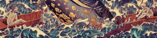
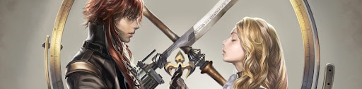
 As the cumulative artwork for the Shining Tears and Shining Wind series', the work he had to do is certainly extensive and I’m thoroughly impressed by the sheer amount of full colour illustrations he managed to churn out during his time with the video game series. They’re action RPGs, not visual dating games, so this amount of artwork from a single artist is usually quite unheard of. I imagine it must have been very taxing on Tony Taka, especially considering his origins as a doujin artist. Perhaps, he could have tried to illustrate more dynamic scenes since almost all of them are static, but I do understand that he hasn't had much practice drawing them.
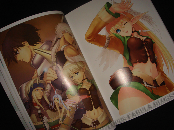
 The last third is devoted to character designs from both games. I don't have much to comment about them, but I did appreciate the attention to detail. They're not just simply printed on blank sheets, but the vine and dot pattern added in the background works well without being too distracting. I also like how even the most minor characters have at least two depictions (a close up and a full body). Some of the major characters have three+ or even a few pages dedicated to them.
 If I could just make the smallest point of criticism about the art work, it's the fact that Mr. Taka is foremost a character artist of young females and he isn't interested in much else. On the other hand, this complaint is not entirely fair, since... as one of the few collections of his non-H work, this art book actually offers a lot more variety and less focus on girls in compromising positions. However, I cannot deny that "fan-service" is still very strong. Mr. Taka has made an effort to draw more males, decrease his "pin up" favouritism, and even create some anamorphic designs. For "working outside his comfort zone," I commend him.


Ending Notes
- Tony Taka poured his sweat, blood, and, tears into the Shining Wind Series and that amount of devotion doesn't go unnoticed. I wonder how much time he had to put in to illustrate all of these paintings. He must work fast.
- This is most likely the single biggest collection of Tony Taka's non-H work so if you're a fan of his work, you won't wanna miss out.
- Something I only noticed while reviewing this book, The back shots of Elwing and Xecty on the back cover show sublime Mucha-esque hair. I adore! XD
Final Rating
 - Strongest point: The sheer quantity of full colour, full background images. Tony Taka worked his ass off when making these games and he very well exceeded what could be considered to be a "normal level" of contribution.
 - Weakest point: The "Udon Template," meant the loss of the Japanese perks (hardcover, holographic cover, slipcase). I value the quality of materials used in the Japanese release more than being frugal so I will most likely purchase the Japanese release again. For those of you like me, skip the NA release and import it from Japan instead.
8.9/10 <- Aside from my complaint about the "Udon Template," I can't deny its artwork quantity and adequate construction quality.


