
Perhaps it's a bit redundant to review a book so similar to Junography so soon, when I have a multitude of others just waiting to be reviewed. Oh well, you'll have to make do since I want to review this one. :)


 I really stared hard at some of the pages and I also noticed one very unique and slightly peculiar print characteristic. The colour ink has a different texture than the white paper. I even noticed the coloured parts appear to high gloss whereas the pages are only mid gloss. Because the ink is a different texture, it resembles raised ink. All of these factors make the images really pop from the pages. It's difficult to explain in words and you really need to take in the details by hand to see what I'm really talking about. However, I adore this feature and it's just a great way to finish an already superb print quality.

 The second half of the book is what really got me excited though. The World Guidance includes all the artwork that is rarely ever seen by the public, if there wasn't an art book. NPC concept designs, the fantastic towns and villages of Lineage, a drool worthy weapons manifesto, and finally monster designs are the most delightful additions for me. You have to have this kind of "behind the scenes" look for a game art book. I mean how many years go into developing a triple A title? How much of that blue print work is ever available outside the company building? Atleast a portion of that foundation work should be shared to the fans, and this "rough work" is just as important as the more "elaborate" promo pieces.


 - I have seen Jeong Juno's artwork in smaller art books, but due to the amount of details in his artwork, He needs ATLEAST an A4 format art book. I really appreciate this about The Ark.
 - Strongest point: Loved the depth of the featured pieces. You not only get illustrations or character work, but also more obscure artworks such as NPC designs, early concept work, monsters and an encyclopaedic collection of weaponry.
The Ark is a collective work from a Korean computer MMORPG called Lineage II. Lineage II has been around for more than 6-7 years now, and has an extensive international following. Its servers are still up and operates as one of the most successful MMOs on the market.

Basic Stats
Title: The Ark - Lineage II Illustrations
Author/Artist: NCSoft
Publisher: SoftBank Creative
Pages: 127 pages
Dimensions: 21 x 30 cm :: Soft cover with Dust Jacket
Date of Publication: Oct. 10, 2005
ISBN: ISBN-13: 978-4-7973-3111-0 | ISBN-10: 4-7973-3111-9
Date of Publication: Oct. 10, 2005
ISBN: ISBN-13: 978-4-7973-3111-0 | ISBN-10: 4-7973-3111-9
Retail Price: 2800 yen


Construction
I have to say construction is for the most part, fairly standard to the usual Japanese fare with some very much appreciated added frills. I love the bronze metallic inlay of the female mage on the cover. From an angle it just looks like mocha coloured ink, but upon closer inspection, there's a beautiful bronze shine. I love it. The pages are mid gloss, and it's funny because this doesn't bother me. On the contrary, I think I really like it. The art work seems to pop more and I'm not noticing any fingerprint smudging because of the white backgrounds. I have no complaints about the glossy pages in this book. The paper is a bit thin, perhaps high quality mook standard so you do get some reflecting. I didn't really notice it being an eyesore upon a quick flip through though. Colour accuracy and print quality is definitely above standard. Everything is so bright and colourful with no muddled colour or signs of cheap reproduction.

 I really stared hard at some of the pages and I also noticed one very unique and slightly peculiar print characteristic. The colour ink has a different texture than the white paper. I even noticed the coloured parts appear to high gloss whereas the pages are only mid gloss. Because the ink is a different texture, it resembles raised ink. All of these factors make the images really pop from the pages. It's difficult to explain in words and you really need to take in the details by hand to see what I'm really talking about. However, I adore this feature and it's just a great way to finish an already superb print quality.
Content
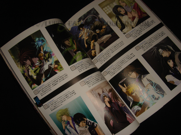
All of the art work featured is from Lineage II. Fans familiar with the game will also be familiar with the style of the artwork and what's included. This means alot of Arthurian fantasy elements such as armoured knights, wizards, dragons, etc. Think LOTR, but with an Asianified art style. rofl. In my opinion, the poster girl for Lineage II has always been the flaxen haired elf maiden, so you'll see alot of her and different iterations of her image throughout the book. Not that I'm complaining. I think she's beautiful and kick started a hugely popular trend of the "elf girl". Presentation is also a non issue. Most of the images take up 80-90% of the white on the paper, some are full bleed double spreads and only a small portion are half paged or smaller.

The book is divided into two sections. The first being labelled as "The Art Gallery" and the second, as the "World Guidance". The Art Gallery is about 40 pages long and is composed of images that have been exposed and seen before. Anything from character designs, to full illustration, promotional art work to concept work, it's the spectrum of artwork that is expected in any art book. I gotta say, a few of the concept pieces I couldn't recognize at all, or were very rare and seldom seen.
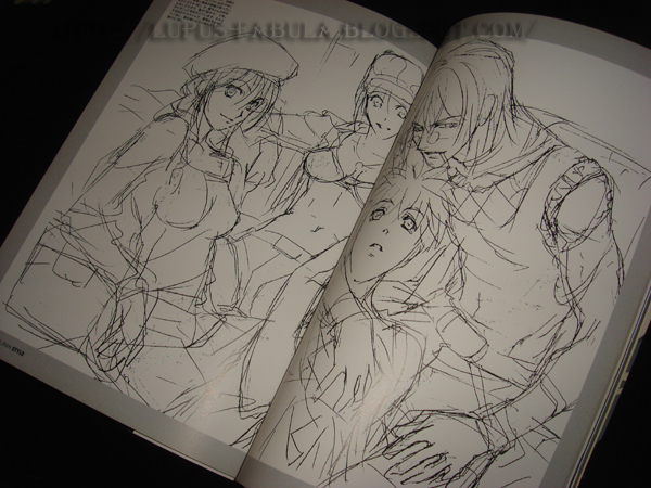
 The second half of the book is what really got me excited though. The World Guidance includes all the artwork that is rarely ever seen by the public, if there wasn't an art book. NPC concept designs, the fantastic towns and villages of Lineage, a drool worthy weapons manifesto, and finally monster designs are the most delightful additions for me. You have to have this kind of "behind the scenes" look for a game art book. I mean how many years go into developing a triple A title? How much of that blue print work is ever available outside the company building? Atleast a portion of that foundation work should be shared to the fans, and this "rough work" is just as important as the more "elaborate" promo pieces.

Ending Notes
 - I have seen Jeong Juno's artwork in smaller art books, but due to the amount of details in his artwork, He needs ATLEAST an A4 format art book. I really appreciate this about The Ark.
 - My only complaint is that it's too thin :/ I wish there was more or atleast if the weapon designs were larger and more spread out.
Final Rating
 - Strongest point: Loved the depth of the featured pieces. You not only get illustrations or character work, but also more obscure artworks such as NPC designs, early concept work, monsters and an encyclopaedic collection of weaponry.
 - Weakest point: In all fairness this was released in 2005, during the mid years of the game so I couldn't expect a complete collection of Lineage II art work. However, for a game of this calibre, there is easily enough artwork for double the amount presented. In short, it's too thin.
8.5/10 <- Great for what it is, but could offer a bit more content